Love + Money + Shopify
We were recently approached by Shopify to talk about the latest iteration of the frank body website, and how we helped Frank Body transition from a single-product store to a skincare company with multiple SKUs. S: Tell us about Love + Money L+M: We’re a team of strategists and creatives who design brands and businesses for the digital age. […]
We were recently approached by Shopify to talk about the latest iteration of the frank body website, and how we helped Frank Body transition from a single-product store to a skincare company with multiple SKUs.
S: Tell us about Love + Money
L+M: We’re a team of strategists and creatives who design brands and businesses for the digital age. What that means is, we take the strategic and creative components that we’ve learned from the worlds of traditional advertising and branding, and execute them primarily on digital platforms. As a result, we work with SMBs looking to take their business online (in a more meaningful, results-driven way), ecommerce startups who’ve seen success and growth in their first 1-2 years and are looking to take their business to the next level, and people with great ideas of their own that need strategic and creative work to bring their businesses to fruition.
So, we typically work in three models: as a more typical agency, taking a set fee; for love, where we want to see a great idea or cause come to life, and charge the bare minimum in order to make it happen; and as a venture partner, where we take equity in what we see as a potentially a great business opportunity in return for our services.
S: How did you get in touch with Frank Body?
L+M: We’ve been with Frank Body since the very start, when it was simply a wild idea. We did the initial logo and packaging as a very simple, very quick job. The secret for us was to create something that was basic and clear, but that could grow if and when it needed to without having to start again from scratch.
S: What in particular about their website needed to change?
L+M: Their website, like their brand, was really initially only designed for a single product — a humble coffee scrub. Then, we needed to introduce variants on the scrub product, which pushed our original, extremely simple design solution to its limits. The challenge was transitioning from this single-product ecommerce platform, all the way over to a skincare company with different products and SKUs.
Additionally, they needed a website that could provide a little more background on the brand, as their Instagram channel was doing. One of our mandates was to move the brand beyond the social media channel that had allowed it to grow so quickly, and into the big wide world, positioning it strongly for growth both on and offline.
We found that the vast majority of traffic was coming from the Instagram channel, which was fine, but traffic coming from other sources was bouncing, largely because they didn’t understand what the hell was going on (Why is there a picture of a babe covered in coffee? What’s this got to do with skincare?). So we needed to make sure that we took time to introduce this rather disruptive concept more fully, as well as detailing the benefits of the natural ingredients that were painstakingly selected for each product. We needed further info like how to use the product, or which products to use together.
All in all, there was a lot that needed to change. So we started from scratch and built from the ground up.
S: What was your design process like for the redesign?
L+M: We started, as we always do, with the brand, and making sure that we were saying everything we needed to be saying. In order to extend the range beyond a single, simple product, and make sure we were targeting a broader market, we needed to go back to the start. We audited and reassessed everything that had been done to date: what had worked, what hadn’t, and asked consumers directly what they wanted to see from the brand (the response was pretty incredible, actually).
We crafted a new strategic positioning, and refreshed and expanded the brand identity to accommodate both the new product range and positioning, but also any further growth or development in the future. We worked closely with Willow and Blake to start thinking of ways to produce a little more depth and substance behind the concept of ‘babes covered in coffee’ in order to reach out to our audiences in a sustainable, genuine way that they could identify with beyond an Instagram trend. We needed to think more about ‘why coffee?’ and, indeed, ‘why babes?’
Coffee was easy: coffee, it’s been proven, has all sorts of natural benefits when applied topically. It’s also fun, and invigorating.
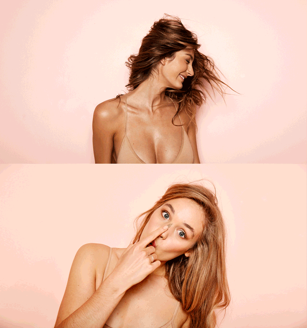
Babes was a little harder. But we reasoned that, rather than being hung up on making babes look good — which most people in the industry are trying to do — we realised that this product, this brand, and this business, was all about making babes (who we define as ‘anyone with a body’) feelgood. This related both to the aspirational, emotive characteristics of the brand (fun-loving, cheeky, sexy) and the physical, tangible ones, too (exfoliants and balms literally make your skin feel good.) So, we ultimately came to a logical conclusion, which served as the maxim for the entire brand:
” Every body is a babe. “
We worked with the single strongest element of the frank brand — Frank’s cheeky, gallant tone of voice — to create a type-based visual system that could be added to, subtracted from, chopped up and changed as and when necessary.
This became the literal building blocks of a design language that we could extend beyond the original scrub packaging (a sticker on kraft paper bags) to bottles, tubes and tubs of every shape and size, across four distinct categories for product development: Tough, Smooth, Clean, and Smooth.
Our process is always designed to set a brand up to be able to grow and adapt to a changing market, consumer requirement, and business direction. The strategy was — and always should be — that a bit of thinking up front saves a lot of backtracking in the long run.
All of this came before we began sitemapping, wireframing, concepting, and directing the production of video and photography assets, and, of course, developing. All in all, it was about nine months of pretty solid work.
S: Where did the inspiration for the shop’s design come from?
L+M: We know that one of the biggest challenges with ecommerce is that users don’t get to interact tangibly with the product, so we wanted to make it feel as alive as possible. We wanted to show what that product looked and felt like. This made video an obvious choice. We loved the Airbnbhomepage; the way an image came to life.
We looked at stores like Voo Berlin for their clarity and focus on photography within the cart. Harry’sis the gold standard for simplicity and clarity, especially in terms of user journey.
As a site that sees most of its new users through mobile-first (50% of overall revenue is from the mobile site), and still sees the vast majority of first-time users through Instagram, we wanted to mimic the usability of the Instagram app as much as possible, to make it seem seamless and obvious. That’s why the nav collects and pushes, and why all crucial navigation is vertical — it’s meant to feel like an Insta feed.
S: What changed along the way?
L+M: Pretty much everything, actually. We had to change the photography art direction a number of times, and had to can the photography we got. It didn’t really feel up to scratch, or in line with the rest of the brand. So the introduction of video into the product category page was a bit of a last-minute snap decision (we’re looking at AB testing some alternative category page layouts at the moment). That tabbed navigation that collects (on the LHS on desktop and in the centre on mobile) is about the only thing we knew we wanted, and that stayed locked in.
S: What were some unique features Frank Body wanted?
L+M: The element of brand and personality through image, video and copy was pretty unique for an ecommerce build. Where a lot of businesses opt for a straight storefront, we knew we had a lot of brand building to do in order to provide context, both to new users and return customers. After all, girls rubbing coffee on themselves isn’t the sort of thing you see every day.
S: The tone of the writing on the Frank Body site is very unique. Did you assist with copywriting? Did they talk about why they chose the tone they did?
L+M: There’s no doubt that the copywriting makes the brand what it is. It’s the hard work of our sister agency, Willow and Blake — this business is part owned by the directors, so the brand is literally at the heart of this business. They found an opportunity to leverage the way consumers talk to each other on social media and build an entire business out of it, which is what’s made everything feel so different, and so unique from the start. In the age of content-driven media, it’s an incredible example of how a brand can rethink the way it can connect with consumers.
We did work with adapting the tone of voice to become a little broader, and a little older, and of course we do some of the incidental copywriting across the site and packaging, and generally help out where we can.
S: What tools did you find most useful when creating the website?
L+M: We’ve used IFTTT to aggregate a lot of the social content on the site, which is a wicked little tool, as well as a live Instagram aggregator that we developed ourselves a few years ago.
S: What integrations did you use with the site?
L+M: The seamless integration of individual international stores, a much more dynamic blog, and a pretty heavy CRM platform. As a result, the site you see is actually a WordPress blog (which runs a geolocator), six individual Shopify stores (AU, US, EU, UK, CA, INT) and a hosted desk.com CRM. We needed to make it feel as seamless across each platform as possible. We also had to serve all of our video through a Vimeo account.
S: What’s your favourite feature on the site?
L+M: A few years ago we wrote our own little code that pulls posts from the Instagram API, so that you can have a live update of the content on any given Insta channel (it works for hashtags, too) and see the likes and comments it’s gathered. There are a few products like this on the market now, obviously, but I’ve always been really fond of ours. I can’t think of a more appropriate website for it to feature on. Actually, on that, we broke the Insta API within the first few hours, as traffic was so heavy. Haha.
S: What was the most difficult part about creating this shop?
L+M: Sounds ridiculous, but those bevelled edges on our boxes — that’s something that’s, for whatever reason, still really hard to render in CSS, especially in Chrome. Go figure.
S: What did you learn while creating this website?
L+M: While we’ve long known (and talked about) the importance of iterative design and development, a project like this really makes it hit home. Starting with the basics, building/adding, and then refining, is the best possible way to deal with changing parameters and shifting goalposts. It also keeps your ideas sharp, your concepts more robust, and your fragility to a minimum. Allowing for a period of three months of monitoring and optimization post launch is really integral, and something that every client and agency should be planning for.
They say that if you know exactly what you’re doing, you can’t be doing anything new. And that’s very much the case — even if you have a lot of experience and knowledge in any one given field. In this field in particular, the only way you can comfortably build and create anything new (and in our view, if you’re not doing anything new, what’s the point of being you?) is to allow yourself the ability to learn from actual testing and feedback, both from your client and, ultimately, your consumer. This, we believe, is the essence of ‘branding in the digital age.’